Custom App Theming
Overview
WorkBright's custom app theming feature empowers you to create a branded, cohesive experience across your entire application when embedding the WorkBright application. By configuring themes through a structured JSON API, you can apply your organization's visual identity while maintaining WorkBright's proven UI/UX standards.
Why Custom Theming?
- Brand Consistency: Apply your colors, fonts, and visual elements throughout the platform
- Enhanced User Experience: Create a familiar environment that aligns with your company's digital presence
- Professional Appearance: Deliver a polished, enterprise-grade experience to your users
- Easy Maintenance: Update your theme globally with a single configuration change
How It Works
Custom themes use a JSON configuration format that automatically translates into CSS variables applied globally across all application pages. The system uses nested JSON structures to organize style properties logically, making theme management straightforward and maintainable.
NoteTo maintain consistent and high-quality UI/UX, only a defined set of styles can be modified through the theming API. Any unsupported values will be rendered as CSS variables but won't affect page element styling.
What You Can Customize
WorkBright theming allows you to modify key visual elements across six main categories:
📝 Body Text & Typography
Control the default text appearance throughout your application:
- Font Size: Set the base font size for body text
- Text Color: Define the primary text color used across the interface
🔗 Links & Navigation
Customize how links appear and behave:
- Link Color: Default color for clickable links
- Text Decoration: Underlines, styling for link text
- Hover States: Color and decoration changes when users hover over links
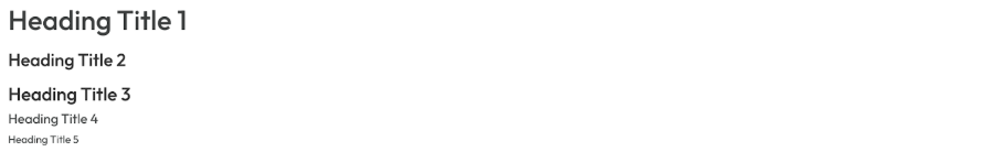
📰 Headings
Style all heading levels (H1-H6) with consistent branding:
- Font Size: Individual sizing for each heading level
- Font Weight: Bold, normal, or custom weight values
- Color: Specific colors for headings that differ from body text
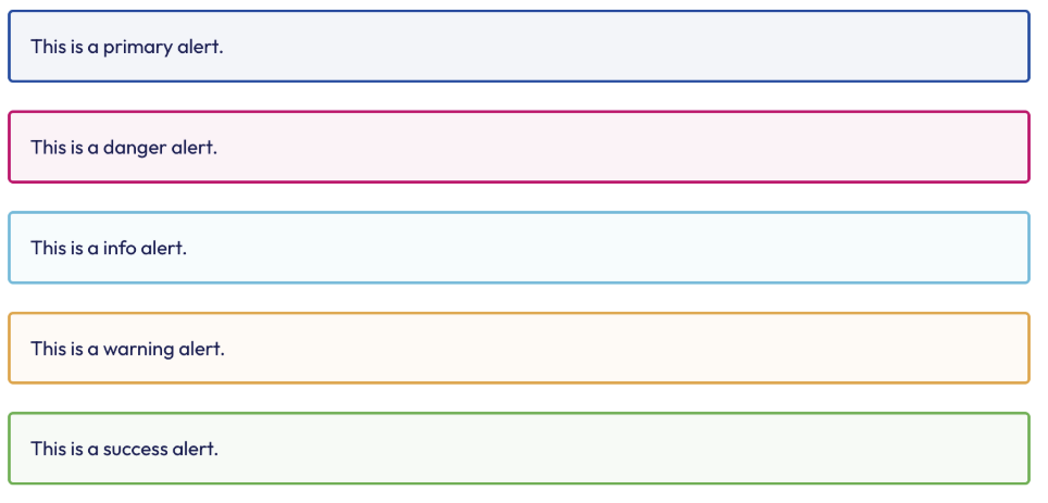
🚨 Alerts & Notifications
Customize system messages and notifications with variant-specific styling:
- Border Properties: Width and radius for alert containers
- Variant Colors: Background and border colors for different alert types:
- Primary: Main brand alerts
- Info: Informational messages
- Success: Positive feedback and confirmations
- Warning: Caution and advisory messages
- Danger: Error messages and critical alerts
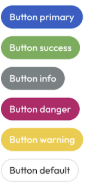
🔘 Buttons & Interactive Elements
Style buttons across different contexts and states:
- Border Radius: Rounded corners for button styling
- Variant Styling: Colors for different button types (default, primary, info, danger, success, warning)
- Active States: Background colors when buttons are pressed or active
- Border Colors: Outline colors for button variants
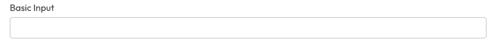
📝 Form Controls & Inputs
Customize user input elements throughout the application:
- Border Styling: Default border color and radius for input fields
- Focus States: Border color when users click into form fields
- Consistent Appearance: Unified styling across all form elements
Configuration Structure
All customizations follow this JSON structure:
{
    "custom_app_theme": {
        "body": { /* Body text styling */ },
        "link": { /* Link styling and hover states */ },
        "headings": { /* H1-H6 typography */ },
        "alerts": { /* Notification styling with variants */ },
        "buttons": { /* Button styling with variants and states */ },
        "formControls": { /* Input field styling */ }
    }
}
See API Documentation for more details on the JSON structure and available request methods.
Updated 7 months ago